Photo-Illustration: Curbed; Photos: Nick Poe, Greta Hansen, BAAB
A bedroom exactly as wide as a bed? A kitchen without an inch of counter space? Just another day in New York City. Average apartment sizes are estimated to have shrunk by as much as 10 percent over the last decade, and many of us are doing a lot more with a lot less. For designers, it’s a challenge that’s not without its pleasures: While an apartment is neither a concert hall nor a museum in its scale and ambition, a bite-size interior can be a chance to show off. “The smallest spaces are the ultimate Rubix cubes,” says architect Greta Hansen. We talked to her and a few other designers about the small-space puzzles they’ve solved, from a minuscule duplex to a windowless, leaky bathroom in the middle of a house.
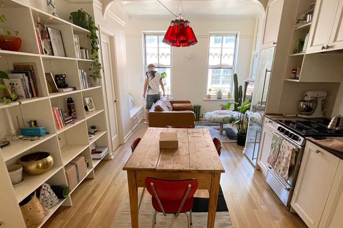
The small 200-square-foot first floor holds the living, dining, and kitchen areas; custom shelving and seating by Wolfgang & Hite bring more space and storage to a small area.
Photo: Greta Hansen
Designers: Wolfgang & Hite
Project: Total apartment overhaul
Budget: Approximately $10,000
Greta Hansen and Shan Raoufi’s apartment on the Lower East Side is small, but it comes with a surprisingly spacious terrace that looks out over the East River. To get there, though, you have to climb up a spiral staircase. It’s part of the apartment’s charm and also part of the problem. “It was really hard to accommodate both a living room and dining room with so many obstructions — especially that spiral staircase,” says Raoufi. With just 200 square feet downstairs and a tiny lofted bedroom above, the couple behind architecture firm Wolfgang & Hite decided to design more space and storage in their apartment while satisfying their aesthetic standards (not to mention sticking to a small budget — they successfully kept the reno below $10,000).
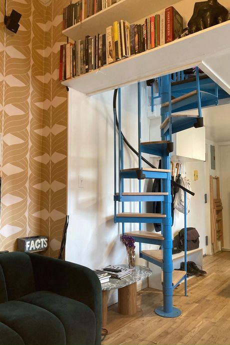
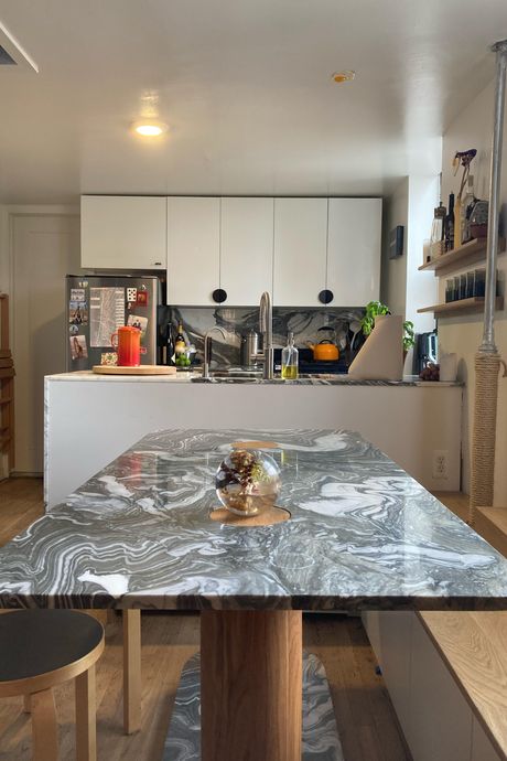
Book storage tucked into the walls, by Wolfgang & Hite.A custom dinette and newly renovated kitchen by Wolfgang & Hite.Photos: Greta Hansen.
Book storage tucked into the walls, by Wolfgang & Hite.A custom dinette and newly renovated kitchen by Wolfgang & Hite.Photos: Greta Hansen.
“I was tearing my hair out, drawing the plan over and over,” says Hansen. Through their 18-year practice, they had solid carpentry skills and a lot of experience making custom furniture, so the duo did much of the serious work themselves — installing a sleek wooden bench that snakes around a custom corner dinette (and an inconveniently placed heating pipe), and making a pair of matching stools and a marble table with rounded edges. All of this complements the kitchen they also redid in marble and white laminate.
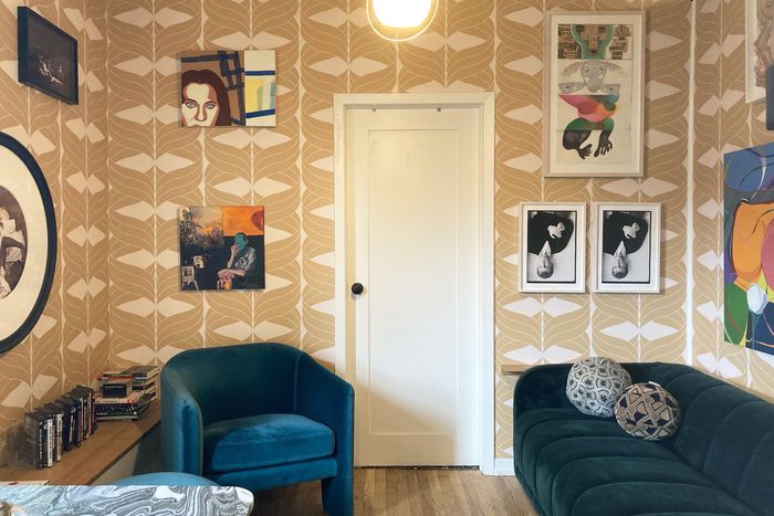
The designers then had the banquette do double duty as a bookshelf for the sitting room next door, where the space transitions from the minimalist white-laminate kitchen to a more ’70s-era lounge. “Making this secret place for the books was basically the only way you could get them in there,” says Raoufi. The first floor shelters one additional secret as well: a tiny secondary bedroom, “barely bigger than a closet,” says Hansen, but a convenient place to stash out-of-town visitors who don’t mind the cramped quarters.
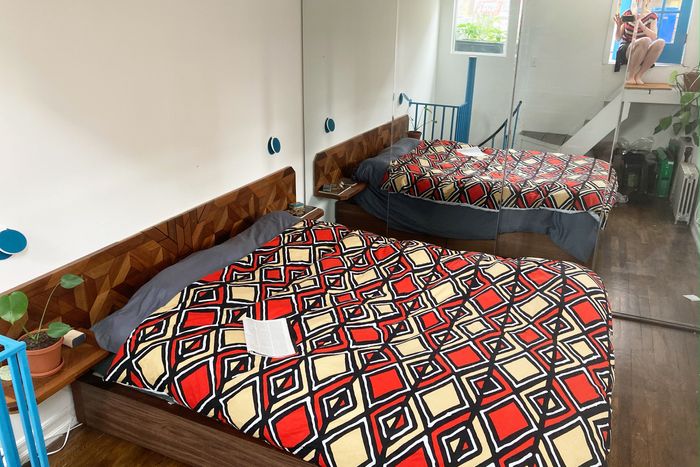
The small lofted bedroom that leads to the terrace.
Photo: Greta Hansen
On the second floor, the minuscule sleeping area posed a conundrum — especially given the aspirations of its users. “We always wanted a walk-in closet,” says Hansen. With little room to operate in the barely five-by-eight space, Wolfgang & Hite chopped it down still further by putting their dreamt-of storage in the rear; they then compensated for the cramped space by installing nearly floor-to-ceiling mirrored doors to make the space feel a bit roomier, and added storage in with their built-in wooden headboard and nightstands.
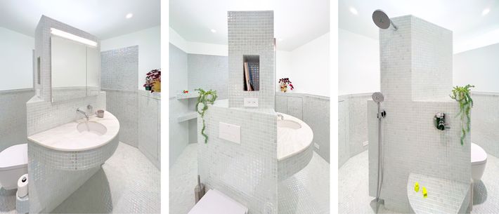
The central bathroom created by BAAB has multiple functions and no walls.
Photo: BAAB
Designer: BAAB
Project: Bathroom renovation
Budget: Approximately $20,000
“It was a shit bathroom,” says Ted Baab. When the architect — a longtime associate at Brooklyn firm SO-IL, now operating his own practice — started work on this 75-square-foot space for a client, it was embedded awkwardly in the dead center of a three-bedroom house in the Catskills. Inside, it was windowless and airless with crumbling tiles and little storage, and it constantly filled up with puddles after someone took a shower. The client did not provide much aesthetic guidance beyond, according to Baab, “make it feel playful and nice to use,” and no specific budget beyond “the usual for bathrooms this size” (about $20,000 in all, Baab estimates).
So Baab devised what he calls “Inside-Out Bath,” a scheme that transforms the room into a 1930s Machine Age invention. A big, blocky wall volume, shaped like an isosceles triangle and containing all the mechanicals and plumbing, is planted in the middle of the room; all of the fixtures emerge from it — the sink, the toilet, the shower — as do handy built-ins like a toilet-paper holder, mirror, and a curving shower seat. No curtains, no doors, no drawers: Just a lot of gleaming tile, a marble countertop, and a perimeter wall with little carve-outs for storage and garbage, as well as a full wraparound grab bar that allows users to hold on (or sling towels) wherever they like. “It’s a lot to cram in there,” says Baab. An added bonus: It’s easy to clean.
For all the futuristic sleekness of his design, Baab had to be mindful of some very real-world objectives. His clients, who were retired, “said they wanted something that feels safe and that could accommodate their needs as they get older,” he explains. So the whole interior is built for accessibility, in particular the bar and seat. For the same reason, adequate lighting was also a priority, obliging Baab to conceal LED nightlights in the central volume and insert a high clerestory window in the wall that lets in a little secondhand sunshine (but no peeking) from the adjoining living room.
Although, as Baab noted, “All bathrooms nowadays are essentially custom,” his design could be offered as a module that could be installed in any bathroom. Baab had an artistic objective, too. “It’s fun to think of it as this playful sculpture,” he says, or “a totem,” as he calls it.
An apartment renovation for an actress turned a two-bedroom into an airy studio.
Photo: Nick Poe
Designer: Nick Poe
Project: Studio renovation
Budget: Approximately $150,000
Having designed popular Canal Street restaurant Time Sushi Bar and Tribeca’s Jacqueline Sullivan Gallery, designer Nick Poe knows how to make stylish spaces out of downtown Manhattan’s narrow, aging buildings. But when an actress client in Noho came calling, her small-apartment redo turned into a surprisingly big job. “The person who had lived there before had been for like 40 years,” Poe says. During that time, age and some peculiar choices on the part of the previous occupant had taken a serious toll on the barely 400-square-foot space, necessitating a top-to-bottom overhaul.
“Every single bit of it needed to be worked through,” Poe says. Working with a $150,000 budget, Poe replaced the buckled and uneven floors and added an archway, decorative molding, a raised-dais entry to the bathroom, and soft coving at the corners where the walls meet the ceiling. All the detailing gives the interior a sense of spatial variety — and it also creates an appropriate period effect. “The building is from about 1920,” Poe says, “so it felt like the space should be in line with that.”
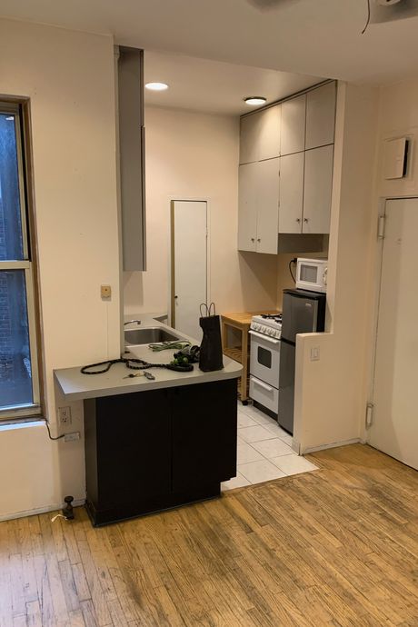
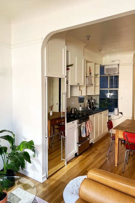
The kitchen before the renovation.The kitchen after the renovation, with arches and coved corners to give the place some period detailing.Photos: Nick Poe.
The kitchen before the renovation.The kitchen after the renovation, with arches and coved corners to give the place some period detailing.Photos: Nick…
The kitchen before the renovation.The kitchen after the renovation, with arches and coved corners to give the place some period detailing.Photos: Nick Poe.
What had been the most unworkable in the old apartment had been its floor plan. “It was pretty wild,” Poe says. “You’ve got this tight studio, and they were using it as a two-bedroom.” The unit had been carved up into three separate rooms with a pair of intersecting walls that divided up the space; the two rooms nearest to the windows were incredibly small, while the kitchen-bathroom suite behind the walls was totally shut off from natural light. It was not what the client had in mind, and it definitely didn’t suit Poe’s desire to maximize light and space.
So he tore down the walls — and, along with the more open floor plan, devised a sleeping nook that gave the actress a little privacy. “I thought it would be really cozy to have this niche,” he says. “Like sleeping in a little boat.” In a small recess to the left of the windows, Poe installed a platform bed with shelving beneath and an inset channel above for a curtain that hid the room when guests were over: voilà, a miniature bedroom alcove.
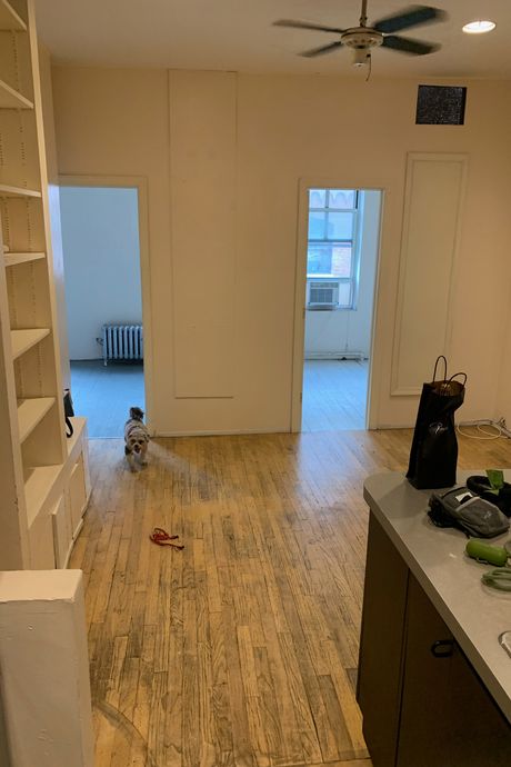
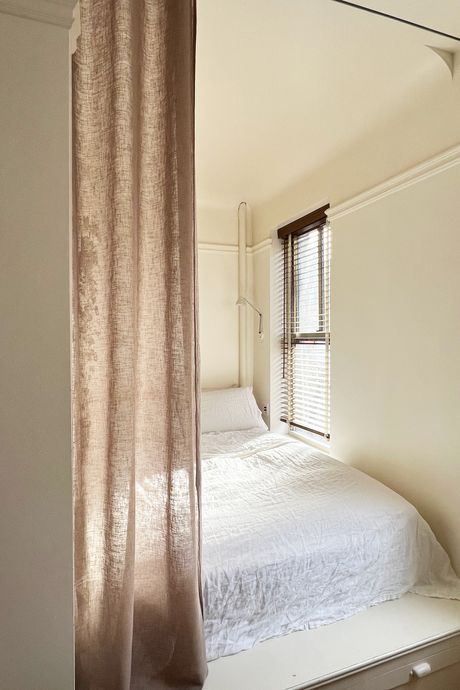
The apartment before the renovation had two small bedrooms, and the living and dining/kitchen spaces were cut off from the windows.The new bedroom nook after the walls came down allows the rest of the space to still have access to light and air from the windows.Photo: Nick Poe.
The apartment before the renovation had two small bedrooms, and the living and dining/kitchen spaces were cut off from the windows.The new bedroom noo…
The apartment before the renovation had two small bedrooms, and the living and dining/kitchen spaces were cut off from the windows.The new bedroom nook after the walls came down allows the rest of the space to still have access to light and air from the windows.Photo: Nick Poe.
See All


